
#93d600
#0632a1
#191919
Summary:
Corporate Essentials is a premier coffee distributor providing coffee services, pantry management, catering, and break room design for offices throughout New Jersey and NYC. The company approached The DSM Group to revamp their outdated branding and website to expand their market presence, particularly into Manhattan, and appeal to a new, more dynamic clientele.
Challenge:
The existing Corporate Essentials website and branding were outdated, poorly designed, and lacked the vibrancy to attract modern businesses. Their one-page website listed services in an unorganized manner, which left visitors with no clear direction or call to action. The brand identity was stuck in the past, featuring clichéd imagery of corporate buildings and people in suits—traits that felt disconnected from the modern, hip image the company wanted to project. Additionally, their logo, colors, and fonts were outdated, failing to convey the energy and quality of their services.
Solution:
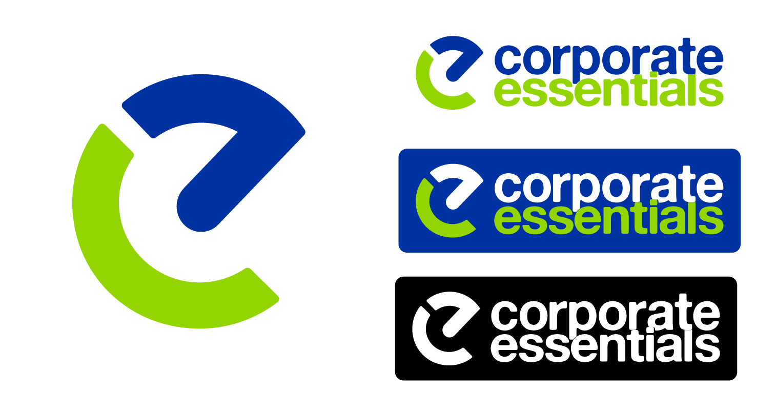
To address these challenges, a comprehensive rebranding strategy was initiated, starting with a month-long logo study. This phase involved exploring various iterations of the logo design that balanced professionalism with an energetic, modern aesthetic. The final design incorporated the “E” and “C” letters intertwined with a universal power button symbol, signifying the idea of powering corporate environments.
The color scheme shifted from dull, corporate tones of brown, black, and white to a more vibrant combination of blue, green, and white. Simple, bold fonts were chosen to complement the updated logo, creating a cohesive brand identity.
Web Design:
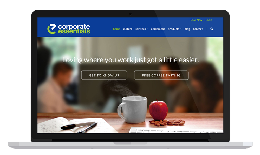
The new website was built to be more engaging, user-centric, and SEO-friendly. It featured a clean, modern layout with easy navigation and content tailored to the audience’s needs. High-quality imagery highlighted the brand’s services, such as locally sourced coffee, fresh snacks, and pantry solutions. Strategic use of photography showcased Corporate Essentials as a forward-thinking, approachable company, emphasizing the health-conscious and convenient aspects of their offerings. A/B testing and data analytics were employed to refine user experience and optimize time on page.
Results:
The redesign yielded significant improvements:
Traffic: The website experienced a 100x increase in traffic due to a refined SEO strategy and targeted keyword campaigns.
Engagement: Average time on the site nearly tripled, driven by engaging, user-focused content and visual appeal.
Market Expansion: The enhanced brand identity and digital presence allowed Corporate Essentials to successfully enter the Manhattan market, competing with established competitors.
Recognition: Over the years, the company’s branding spread beyond the website, appearing on uniforms, print collateral, and vehicle fleets. The refreshed logo became a recognizable symbol of their commitment to modern service and quality, with Corporate Essentials trucks frequently seen throughout Manhattan.
Conclusion:
Corporate Essentials’ rebranding project successfully transformed a dated and disconnected company identity into a modern, attractive, and professional brand. This strategic overhaul not only boosted online visibility and customer engagement but also facilitated entry into a competitive market, cementing Corporate Essentials’ reputation as a forward-thinking, dynamic service provider.
Client: Corporate Essentials
Role: Logo Design Team, Branding, Web Design, UX testing, CRM research