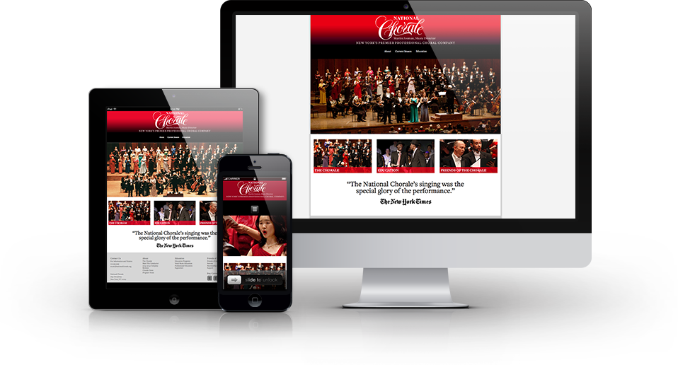
- Client: A New York-based chorale group.
- Industry: Entertainment
- Objective: Responsive and accessible web tool
Challenge:
The chorale’s website was built on an outdated platform incompatible with mobile devices, limiting accessibility and engagement for users, particularly during performances and on-the-go.
Solution:
A comprehensive metrics analysis was conducted to understand user behavior. Results revealed that most visitors accessed the site via handheld phones and tablets, likely while attending events or commuting. Additionally, demographic data indicated that the majority of users were over the age of 50, highlighting the need for a user-friendly, accessible interface that could be comfortably viewed on mobile devices, even in low-light environments.
With these insights, we implemented a new, responsive website optimized for mobile. The design focused on readability, accessibility, and ease of navigation, making it an ideal solution for an older audience and those in low-light settings.
Results:
Enhanced Engagement: The redesigned website led to significantly lower bounce rates and higher engagement from users.
Cost Savings: Attendees could access digital playbills on their devices, eliminating the need for printed playbills and reducing associated costs.
Positive Feedback: Users reported a much-improved browsing experience, with easier access to content and better functionality on mobile devices.
This project transformed the website into a more accessible, user-centered platform, meeting the specific needs of the chorale’s audience and improving overall engagement.